


As a popular technology blog headquartered in Silicon Valley, we were lucky enough to get a chance to try out the final shipping version of the iPhone this week.
If you think that it looks somewhat different from the pre-release versions of the iPhone that were shown off at MacWorld, you’re right: Unlike those, this isn’t a prototype; it’s a genuine released product from Apple.
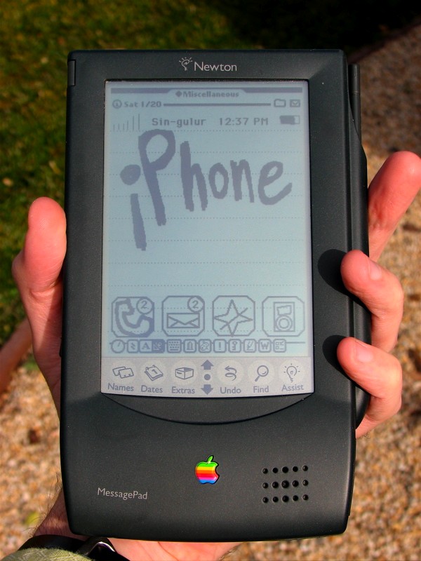
While the device does fit into your hand, it is on the whole somewhat bulkier than I was expecting. However, that’s probably just the effect of being spoiled by the iPod nano and the new shuffle. Compared to those anorexic little beasts, even the “full size” iPods with video seem pretty large by comparison.
The screen is clear and bright, with high contrast, and excellent resolution. We were particularly impressed by how readable the screen is in direct sunlight. On the other hand, the color saturation was disappointing, particularly in comparision to the pre-release versions. My understanding (strictly off the record) is that it will be fixed by the time that the next revision ships.
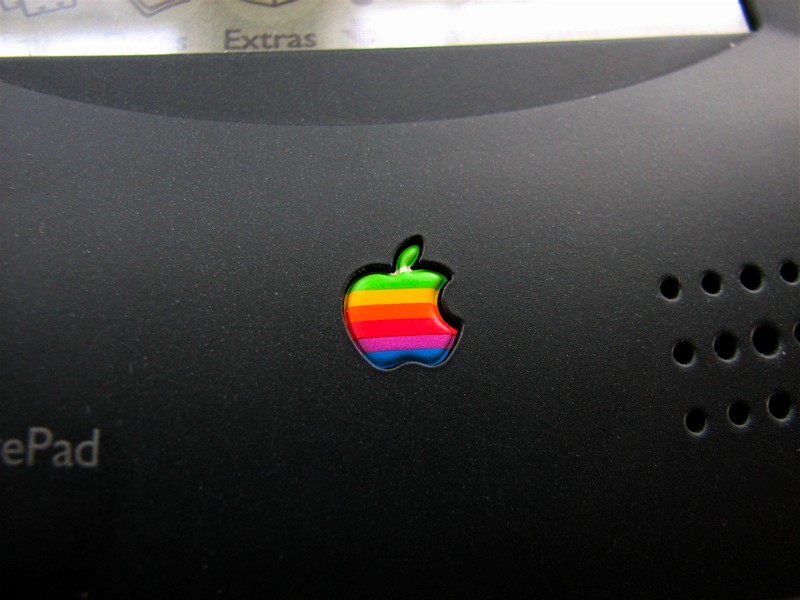
Here’s one of the big surprises in the release version: the return of the classic six-color Apple logo. In the day and age of “Apple Inc.,” it’s actually nice to have it back for a change. On the other hand, that old logo may have changed in connotation somewhat, so it’s not clear whether it’s an upgrade or not.
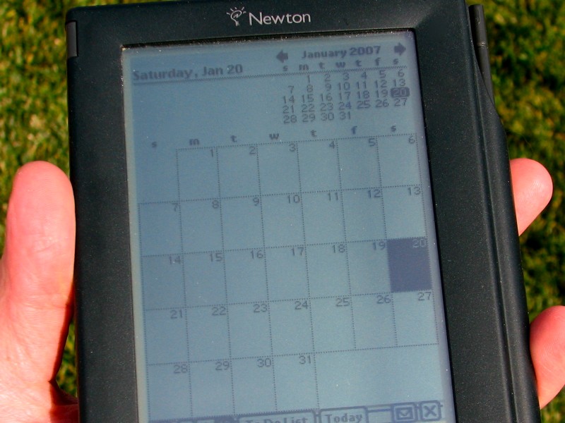
Here is what iCal running on the new iPhone looks like. The month view is very much like iCal on the Mac and it is surprisingly easy to add new dates, events, and contacts.
And of course, there is the ever-present reminder of wireless vendor lock-in.
Some other notes: Battery life is excellent. The multi-touch interface is cleanly executed and works well, although the handwriting recognition leaves something to be desired. (One problem that I haven’t seen anyone else point out is that it counterintuitive to write neatly in cursive with the tip of your finger.)
In any case, thanks to Apple for letting us try out their great little toy!
‘5’ colour logo?
Oops! Having some counting trouble today. ;)
—
Windell H. Oskay
drwho(at)evilmadscientist.com
http://www.evilmadscientist.com/
oh. my. god. I want one so bad. I LOVE the iCal integration. And those buttons. Yummy. Lickable. Positively elegant in their sparse modernism. The design, the style, everything we expect from Apple these days.
Sweet. Nobody else can offer what they do. They are, like, totally unique. no, really. I mean that.
The only thing that would make it better is calling it i-Stein. Then we could all toast it, raise our stein, and have a beer in celebration.
Nonsense – everybody knows that Newton and i-Stein are incompatible! =P
— Dave
Hehehe very funny. But no the old Apple logo never changed connotation. It has always been an blink at the homosexual’s rainbow in honor of the great computer scientist Alan Turing (the guy who broke Enigma) who supposedly committed suicide because of the pressure his sexual orientation had put on him.
As quoted on…
Alan Turing @ Wikipeda
Info about the Apple Corp Logo @ Wikipedia
Understanding the Enigma of the Apple Computer Logo
xSmurf
Indeed, the rainbow flag had its present day meaning by the late 1970s, but it is not clear to me that it had been absorbed so fully into popular culture as it is today.
The last link above– as well as the wikipedia article about the rainbow flag— make it pretty clear that the story about Turing is a myth.
-Windell.
—
Windell H. Oskay
drwho(at)evilmadscientist.com
http://www.evilmadscientist.com/
"One problem that I haven’t seen anyone else point out is that it counterintuitive to write neatly in cursive with the tip of your finger."
To properly communicate in cursive, it is usually most effective to use a different fingertip.
Wait, I may have misunderstood.
hmmm. That looks strangely farmilliar… just like my old pda… i wish i hadn’t dropped it now!
The instruction manual told me that i had to have a working analog land line for the modem to work!
Makes cool noises though when you try to dial numbers via the modem utility! :D
I can’t figure out how to use the damn thing!! Frustrated in NY
http://tinyurl.com/2r7cu4
It’s here already!!! The iPhone and at great prices!!