
Following the
public vote announced several weeks ago, the design above by Macklin Chaffe
was selected as the v 1.0 logo for Open Source Hardware. We hope that this will, in time, become a recognizable mark indicating open source hardware projects and products.
Part of what will help to spur adoption is making the design available in a variety of formats, ready for use in different contexts. Already, we’ve seen versions in
OpenSCAD (for 3D fabrication) and
KiCad (for circuit board design).
To those examples, we’re adding our own: the OSHW logo, ready to use in
gEDA PCB, our favorite software for circuit board design.

Here’s how the logo might look on a printed circuit board, as rendered in gEDA PCB.
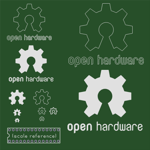
We’ve also rendered it in a few sizes and styles– filled or not, and losing the text as the logos get smaller. You can download this set of examples for gEDA
right here ( 82 kB .zip archive).


Thank you for posting a gEDA/pcb version. I appreciate your usage and support of gEDA/pcb and OS/X.
I shouldn’t speak since I haven’t participated in any of this process but… it looks like a keyhole! Seems contrary to open hardware :P
Yes. On the other hand, it looks like a segment of a gear that’s been opened up.
Windell H. Oskay
drwho(at)evilmadscientist.com
http://www.evilmadscientist.com/
Its too bad there are no good oss feature based modelers out there at the moment. FreeCAD http://en.wikipedia.org/wiki/FreeCAD_(Juergen_Riegel) is the only thing that has potential and its been painfully slow to develop.
They should have just used the copy left microchip one (i voted for it) because at this time OSH is only about PCBs
/opinion
You’re entitled to your opinion about what constitutes "good" software, but open source hardware is not just about electronics.
There *is* open source hardware, and there will be more. We should do our best to encourage it.
Windell H. Oskay
drwho(at)evilmadscientist.com
http://www.evilmadscientist.com/
thank you for your vote :) I just have prepared proper Eagle libs and share all graphic sources. See my comment below.
I think that’s part of the point, it’s a keyhole in a gear symbolizing opening the lock, no restraint. I see it as the lock that opens doors, the doors to open hardware.
I think your design is more symetric than the original graphic; it looks like an actual gear. In the original, the "teeth" are smaller than the gaps between them, sorta making it more of a cogwheel (?)
I implement a version for EAGLE as a user language program, so it can be scaled arbitrarily ("run logo <outsidediameter>") and adjusted in appearance (by modifying the source.)
http://www.openhardwaresummit.org/forum/viewtopic.php?f=5&t=421&p=846#p846
What is the license for use of this logo? Can anybody just slap this on anything or will there be some protection so that the logo will have actual meaning?
>What is the license for use of this logo? Can anybody just slap this on anything or will there be some protection so that the logo will have actual meaning?
This is a young process, and things move slowly. I expect that this should be regarded as a trademark, used to designate hardware that the manufacturer represents to comply with an approved open source hardware license– Those don’t yet really exist either. Eventually, there should be a set of logo usage guidelines similar to this: http://www.opensource.org/logo-usage-guidelines
Windell H. Oskay
drwho(at)evilmadscientist.com
http://www.evilmadscientist.com/
What is the license for this logo?
I like the logo. Entirely appropriate.
We also just posted a font version so the logo can be copy and pasted into any program if anyone wants:
http://www.inmojo.com/blog/april-19-2011-oshw-logo-font-ttf-version/
Hi everybody,
Results of Open Hardware logo competition makes me (and as I suppose, a lot of people with proper taste) hm… a bit oppress. So I peen my (as people name it) "copyleft" logo (which is due to unforeseen entropy fluctuations just 70 votes less) up and would like to share with community.
main image
http://repository.interplaymedium.org/Open-Hardware-Identity/final_design/openhardwarelogo.png
here is Eagle library (in vector, single and text version)
http://repository.interplaymedium.org/Open-Hardware-Identity/final_design/openhardwarelogo.lbr
here is micro-guide
http://repository.interplaymedium.org/Open-Hardware-Identity/final_design/openhardware_logo_microguide.pdf
and graphics sources
http://repository.interplaymedium.org/Open-Hardware-Identity/final_design/openhardwarelogo.sources.tar.gz
please, feel free to use :)
This work is licensed under a Creative Commons Attribution-NonCommercial-ShareAlike 3.0 Unported License.
So, you lost the vote, so you have decided to take to the internet to spam people with your logo and hope they use it instead of the one that won?
Just making sure I’m reading that message correctly…
heh :) I post it in three relevant blogs (include this one) and one forum to inform colleagues that there is a better alternative just in case, if someone with good taste wouldn’t use this hm… (let’s be frank) ugly keyhole.
Will people use this sign instead of selected? this is definitely a matter of choice of everyone. But many people write that, yes. and many of them agree with my assessment. weird, isn’t it?
You need to stop this campaign.
The whole point of voting on a logo was to pick *one* standard, so that we could have a common language. The one that was picked wasn’t my first choice either. But we have, as a community, picked a symbol to get behind, and we have worked hard to get out the message about the new logo. We get that you like your logo better. But it’s not helpful for you to be trying to divide the community in this way.
Furthermore, and importantly, yours is *not* a better logo.
First, because copyleft sends the wrong message. Copyleft refers to copyright. Of all possible forms of legal protection, copyright is one of the least useful for protecting hardware designs. Copyleft is no better.
Second, because it looks like something that should only apply to electronics. One of the issues facing the OSHW community is how we can work to be inclusive towards other types of hardware. Your logo that only looks like it should apply to electronics, and you’ve picked a font that’s hard to machine with physical tools. Both of those facts, combined with the fact that you’re saying that we should use this logo instead of one that suggests a gear (which was a *great* choice, by the way) seem to say “hey mechanical designers: we don’t actually want you in the OSHW community.” That’s just plain wrong.
Finally, how would you like it if your logo were the one selected, but someone else began campaigning on various blogs that you should use their logo instead? Have a little kindness to the designer, please.
Windell H. Oskay
drwho(at)evilmadscientist.com
http://www.evilmadscientist.com/
gEDA/PCB Footprint files of the logo would be super useful.